Charts I am looking at for the week of July 18, 2011
Due to a death in the family, this may be my only post of the week.
Following are the charts that have my interest coming into a new week.
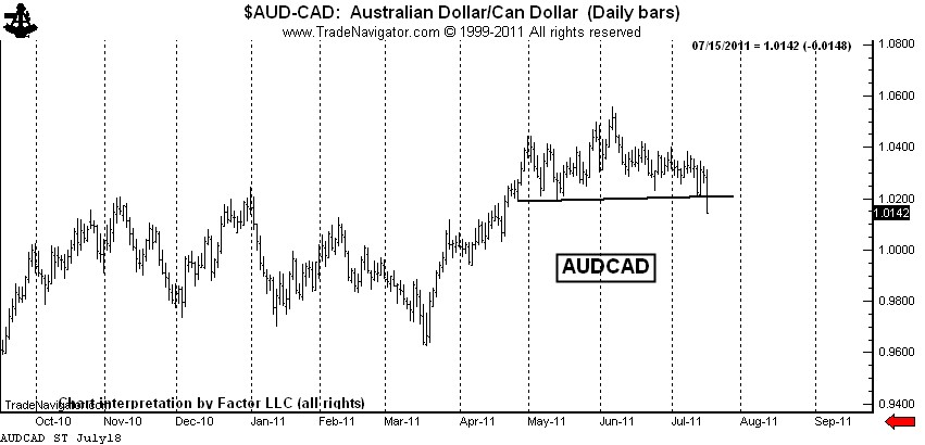
$AUDCAD — This forex pair completed a rounding top last week. I am short, but not as short as I would like to be. I will have orders in place to extend my leverage if the market can retest the top.
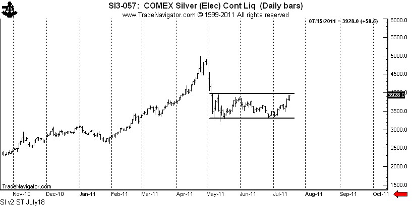
Silver: $SI_F, $SLV — The rally late last week completed a possible symmetrical triangle bottom. The bulls appear to be back in control in Silver. I do not have a position in Silver futures, but am long $SLV with a stop below last Wednesday’s low.
Was my forecast for $20 Silver wrong? Right now that is the way it seems. Trading is a marathon, not a sprint. I have some very bad news for all the Silver bulls who are such fond fans of my blog — I was NOT short last week. Sad, but true! I will let you know when I go short. By the way, I always trade with a stop and seldom risk more than 100 basis points per trading event (one percent of capital). 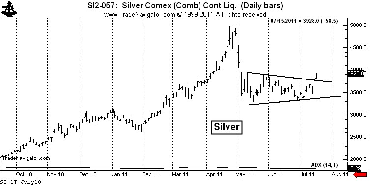
There is another intrepretation of the Silver chart that is not as immediately bullish. I have a great dislike for chart patterns with diagonal boundaries. The symmetrical triangle is my worst enemy. I much prefer a horizontal chart boundary. Silver has not yet completed a bottom if we use horizontal boundaries to define the trading range over the past 10-weeks, as seen below.
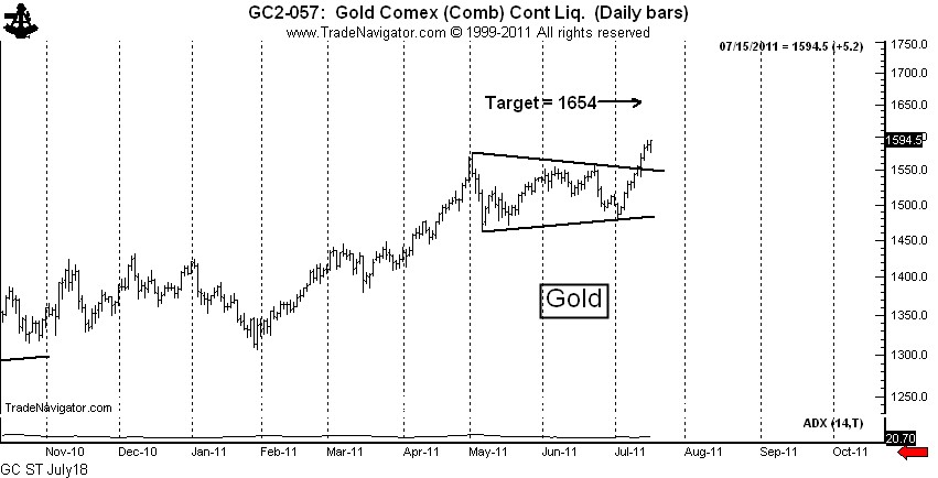
Gold: $GC_F, $GLD — The Gold market completed a text-book continuation symmetrical triangle this past week. I am long Gold futures and Gold ETFs. Gold, unlike Silver, may one day be monetized.
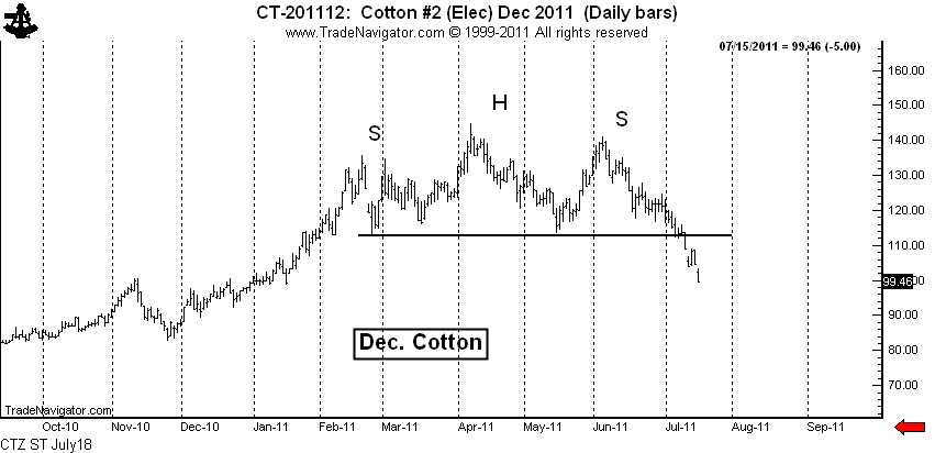
Cotton: $CT_F — I feel like an idiot. I shorted Cotton really well based on the H&S top. I felt like a genius when I covered on Friday, only to have the market go limit down. I really thought the market would cover the opening gap. I got cute — and I doubt the market will let me back in. Big profits are important. I let one get away in Cotton. I should have been adding, not covering.
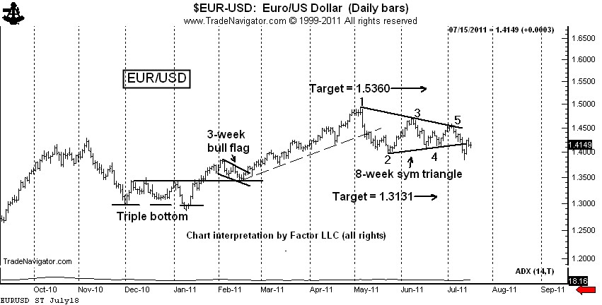
$EURUSD, $G6E_F, $UUP, $FXE — The decline on Wednesday completed a classic 6-point symmetrical triangle top. This completed triangle has been violated intraday, but not on a closing basis. I am short, using Thurday’s high as protection. I really thought I tagged a good one on Wednesday. The forex markets are vicious.
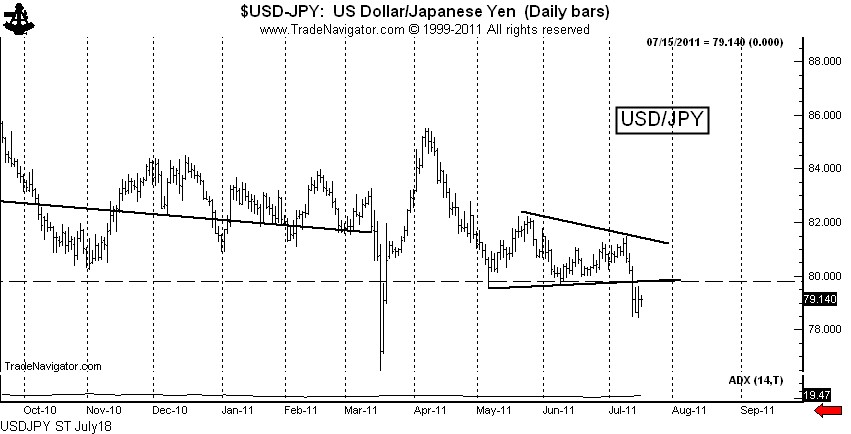
$USDJPY, $G6J_F, $FXY — The decline last week completed a triangle, but that is not the real story. Friday’s close is the lowest week-ending close in history, breaching the 1995 low (not shown). We may see Bank of Japan intervene next week, or it may be that the BofJ is capitulating until a lower price level is reached (such as 75.00). I am short $USDJPY and fully expect to have the BofJ run me out of the trade.
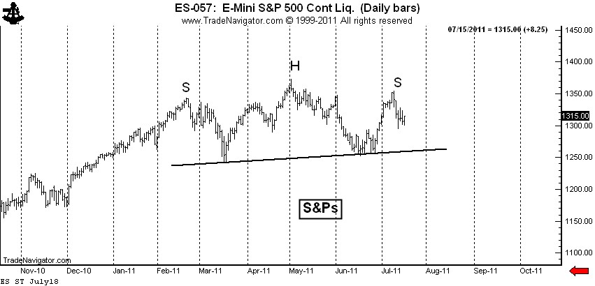
S&P 500: $SP_F, $ES_F, $SPY — This is my “pie-in-the-sky” chart. The daily graph displays a possible H&S top. If this analysis is correct (big IF), the right shoulder high is in place. This chart needs to be on everyone’s watch list. I am flat, tempted to go short under last week’s low. The CFTC Committment of Traders data released late last week was bearish.
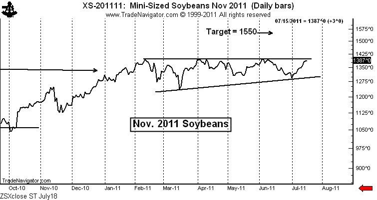
Soybeans: $ZS_F — This is an extremely intriguing chart. I fully expect that this chart pattern will be completed by an upside breakout — whether the breakout has follow through is a different story. I am lightly long Soybean futures with a stop below the July 12 low. I will add if the market breaks out intraday. I will add more if the market breaks out on a closing basis.
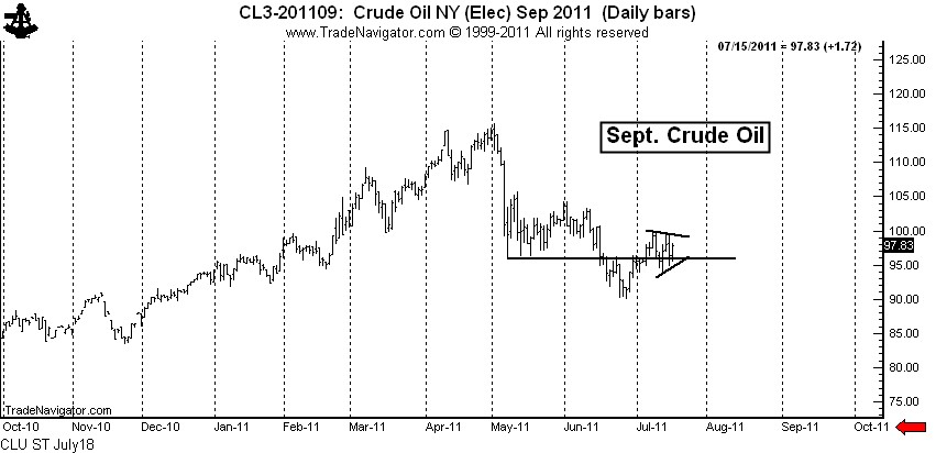
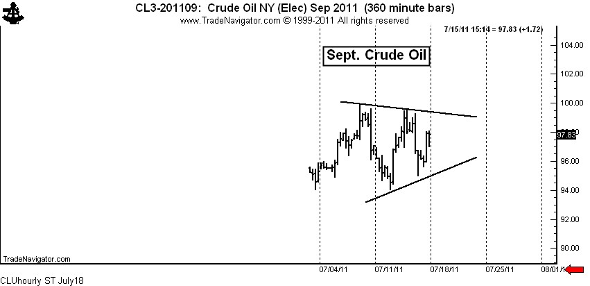
All the above charts are fairly long-term in duration. As a token to you shorter-term chartists, I leave you with Crude Oil. I am not in this market and probably will not become involved due to travel, but an interesting story can be told for getting long.
Crude Oil: $CL_F, $USO — If Crude Oil was in a “for-real” bear trend, then the May low should have turned back any and all rallies. Yet, the market has now climbed back above the May low. This is a sign that the May to June decline was a correction, not the start of a new bear trend.
On a shorter-term basis, the market is forming a 7+ day symmetrical triangle. A completion of this small pattern would probably lead to a test of the June 1 high at 104+. See the hourly chart below.
Let me throw in a couple of final charts. For the first time in a very long time I have some encouraging words for the millions of you who think Natural Gas prices are too cheap.
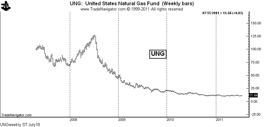
Natural Gas: $NG_F, $UNG, $UNL, $GAZ — Being long Nat. Gas ETFs has been a losing game due to the huge carrying charges that disappear each month. The weekly chart of UNG shows the result of this time decay.
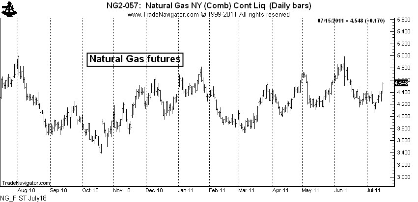
This time decay may continue to take place, but I can say with as much certainty as possible that the physical market has bottomed. The chart of Natural Gas futures shows that the market has lifted well off the 2010 low and is forming high lows and higher highs.
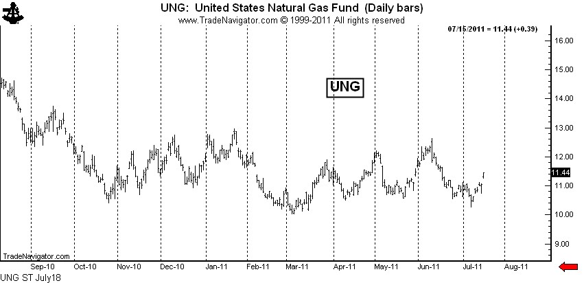
There is also some signs that UNG has bottomed — the March low may hold, despite the massive supply on hand and the negative publicity on fracking.
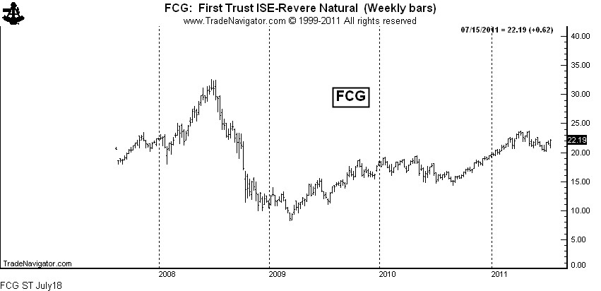
While there may come a time to be long the ETFs for the physical commodity, I would prefer to own the ETF for the producers and other companies deriving income from the production and processing of the product. A chart of FCG ends this post.
Markets: $AUDCAD, $SI_F, $SLV, $GC_F, $GLD, $IAU, $CT_F, $EURUSD, $FXE, $UUP, $ZS_F, $SP_F, $SPY, $CL_F, $USO, $USDJPY, $G6J_F, $UNG, $UNL, $GAZ, $FCG
###
