…and how and why I changed my mind on Sugar.
Blogging during the past several months has driven home one huge lesson – many, many, many self-professed “chartists” do not have the first clue about the purpose of charting and charts.
Some of these same people frequently tweet about charts. Yet, they appear to be clueless. Frankly, I think it is an ego thing. They self-deceive themselves into thinking they get to create their own theories of charting and they have no interest in seeking out the wisdom of the early pioneers of classical charting principles (Schabacker, Edwards, Magee, others).
So, they make stuff up as they go, using their own opinions as the litmus test for truth. These folks will always be around – but over time the exact names will change, because each group of these ego-driven “traders” will leave the arena with their pockets turned inside out. I will make one more comment on this subject later in this posting.
So, exactly what purpose do charts actually serve
Charts are a record of where prices have been. At any given time a chart reflects the opinions of all market participants who have acted upon their opinions by buying or selling commodity contracts, foreign exchange pairs, stocks, ETFs, debt instruments, etc. Charts are maps of where markets have been. Over time a bar chart reflecting this buying and sell may form a recognizable geometric configuration. These geometric patterns can be useful for trading … to a point.
A chart is NOT predictive. Some people believe that if they could only study a chart hard enough, and in the right way, they would be able to determine what a market will do. NOT! I do not want you to miss this next point: Charts do not provide a prediction, they provide a possibility! Sorry, but that is the function of a chart.
A chart provides a trader with an edge. Exploiting an edge is how a trader makes money. I am attracted to classical charting for two reasons. Chart patterns:
- Provide me with clue for what is possible
- Offer – at least some times – an opportunity to construct an enormously asymmetrical reward to risk trading event
Technical analysis, including chart analysis, has earned voodoo reputation. It deserves this reputation. The reason is that technical analysts go on record with market predictions based on their analysis. Most of these market predictions are wrong. Of course, sometimes the predictions are wrong because patterns fail. Sometimes they are wrong because the chart misreads his or her chart. Now fundamental analysts are wrong just as often, but their methods do not earn voodoo status – this is a subject for another day.
There are five primary things you need to understand about charting.
- Most chart formations fail and morph into other patterns, which in turn fail and morph again.
- Charting cannot be used to understand a given market all the time.
- Major moves can occur without any clue from the charts.
- Charts are not predictive. They are a map of where markets have been, not a map of where they are going.
- Charts are a trading tool – and when used as a trading tool charts serve a wonderful purpose.
There are times when a chart morphs, morphs, morphs and keeps on morphing until a huge, no-question-about it pattern emerges. Then I get excited. It is at this point when the outcome of a market becomes a real possibility (not predictive). And it is at then point when I develop a “Strong Opinion, Weakly Held” (see post on this concept here).
When a chart pattern provides a real possibility along with a set up consistent with an overwhelmingly favorable reward to risk profile, then I become really interested.
With this discussion in place, let me transition to the current chart of Sugar.
Sugar — Yes, I changed my mind
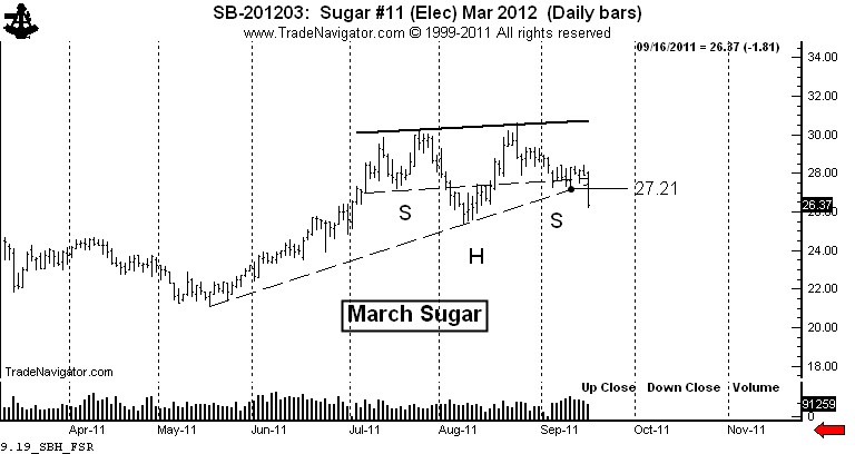
I have had a strong opinion (weakly held) on the Sugar market. This opinion is based on the longest-term charts (not shown) which indicate the possibility for Sugar to trade at 70 cents. Thus, I have been interpreting the daily charts through the lens of this bias.
I believe that a bias can be very good thing for a discretionary trader because if the bias enables an unusually aggressive trading posture at the right time, huge profits can be made. If someone is against the concept of having a bias, then they should develop a systematic approach and dump the discretionary method.
Consistent with my predisposition, I saw the possibility that the daily chart was forming a continuation H&S pattern (or a cup and handle for you snooty tea drinkers). This pattern was forming in such a way that the right shoulder had balance with the left shoulder and also support from a 4-month trendline.
As a trader, the charts showed the possibility and offered an insane asymmetrical reward to risk profile. My strategy was simple.
- Buy a layer of longs near the possible right shoulder low, initially protecting the trade below the August 17 low.
- Add a layer if the market could get above 28.61.
- Add another layer if the market could complete the continuation H&S.
Thus, I had the possibility of establishing long three contracts for each $100,000 of capital. The maximum risk was 80 basis points (4/5th of one percent of capital, or $800 per $100,000). My potential gain per $100,000 if the continuation H&S was the slingshot to 60 cents would have been $104,160 – a possible reward to risk ratio of 130 to 1.
So what were the odds the possibility would become a reality? Maybe one in 20, one in 10, or one in five at the most! I would have been crazy had I not played the Sugar market the way I played it. I would be equally crazy if I continued to insist upon the bullish play when the chart started to tell me something else.
Let me interject one thing into this conversation. A chartist needs to have patience and discipline to be sure, but there is one other thing required to take advantage of the big moves. That is creative imagination. It takes imagination to talk about 60 to 70 cent Sugar when prices are below 30 cents. But, it took imagination back in 1982 to talk about Dow 1,800 when the Dow had never traded above 1,100 in its history. It took imagination in 2007 to talk about 60 cent Soybean Oil when prices were at 37 cents. It took imagination to think Copper would trade at $3.00 when it crossed $1.60 for the first time in history in 2005.
Please connect with what I am saying here – using imagination to think about the possibility of a chart is NOT the same thing as making a prediction or forecast. Charts are NOT predictive.
When I introduce a new major chart development into this blog, I am introducing a new possibility, not a prediction. If you have a problem with the fact that charts are useful to present possibilities, not predictions or forecasts, then I will strongly suggest that you will walk away from your experience trading charts with less money than your currently have.
Back to Sugar – it all changed on Friday. Trading a chart possibility involves creating a scenario on how prices will play out. The scenario never plays out exactly how I imagine, but there have been times when it has been pretty close. Importantly, market action can be such that the possibility is completely nullified.

The decline on Friday carried prices below the existing right shoulder low from September 12 at 27.21 and penetrated the 4-month trendline. The possible price scenario I had been operating under was negated.
Let me share a secret about charting (as if there really are any secrets). Eighty percent of the time when a chart sets up to offer a strong buy signal, inherent in the same chart will be a strong sell signal. In fact, if a chart pattern you are watching does not provide both, then you are well advised to question your interpretation.
The decline below 27.21 on Friday was a strong signal for me to short Sugar. I did do some shorting, but not nearly enough because it is sometimes difficult for me to switch my mind so quickly from one scenario to the opposite read. Yet, my experience is that if I am strongly biased in one direction, a chart signal in the opposite direction has a strong probability of working.
So, I am short Sugar. The market has a pretty good chance of testing the July low. If the market can close decisively under 25 cents, then we have a double top with a target of the May low at 21 cents.
Some concluding comments
You need to know that 90 percent of the content on the internet is garbage. You need to be prudent and wise consumers of internet trading content. Advice is cheap and way too plentiful. Guard your mind as you guard your trading capital. Choose well who you listen to. There are many wolves dressed as sheep in the trading industry. By the way, the StockTwits blogging community represents some of the best minds on the internet.
###

