In defense of a quarterly semi-log chart of the DJIA
Back story
On Nov. 23, I posted a piece titled, “Happy Thanksgiving – the Dow is going to 4,000.” In the post I provided an overview of the DJIA dating back almost 100 years, highlight a possible top on the semi-long chart.
On Nov. 26, another blogger and respected author, Michael Harris, was quick to respond with his post titled, ”Dow 4,000? What Technical Analysis Says or Doesn’t Say About Such Possibility.” In his post, Mr. Harris dissected my analysis with a number of critiques.
I get tons of critical comments by email and on the “genius stream of trader consciousness,” otherwise know as the internet. But a critique from another author and blogger grabbed my attention. This became especially true when Josh Brown of TheReformedBroker – an aclaimed trader and blogger whom I have great respect and admiration – applauded Harris’ post.
This post responds to Harris’ critique of my post on the DJIA. I would like Mr. Harris and Josh to know that this response is not personal, but attempts to address specific items in the critique of my post on DJIA.
My rebuttal to Mr. Harris’ critique
Point 1 – lack of attribution or citation. It is common among scholars or students of a field to provide an attribution or citation to the research of another that is being critiqued. Mr. Harris (and Josh Brown) did not provide a reference to the research analysis (mine) that was critiqued. Josh was focusing on Mr. Harris post, so I can understand his decision not to provide attribution. But as for Mr. Harris, the absence of citation was quite strange and lacks the standard of professionalism that I am certain Mr. Harris has sought in his career.
By way of background, a researcher or analyst normally cites the research he or she is critiquing so that readers can examine the critiqued research for themselves to determine if the critique was fair and balanced. Out of this same respect for professional ethics I am citing Mr. Harris by providing a link to his post in question here. I trust that you, as intelligent and thoughtful students of the markets, can come to your own conclusions on this matter after reviewing my original post, the subsequent critique and now this post.
Point 2 – Mr. Harris did not allude to the many disclaimers I included in my post. In fact, my disclaimers were so clear they might have been written by lawyers responsible for the last 10-seconds of pharmaceutical TV ads. I provided my analysis as a “wild possibility.” Yet, Mr. Harris’ critique (especially because it lacked citation) would imply that my analysis presented a serious possibility. This, in my opinion, is a subtle slight of hand. I am sure this was not Mr. Harris’ intent.
Point 3 – Mr. Harris makes his points, referring to them as “FACTS.” Let’s be honest folks, the real usefulness of technical analysis is to provide a trader with an “edge” by providing an opportunity for an asymmetrical reward/risk profile. Technical analysis of financial markets, at best, is alchemy pretending to be hard science. The label “fact” must be used with great caution when the subject is technical analysis of market prices.
Point 4 – Height of right shoulder in proportion to the left shoulder. Mr. Harris stated that the H&S has already been invalidated because the right shoulder high has exceeded the left shoulder high by 1,000 points. I must admit that this fact has concerned me, and I have stated so, but it does not invalidate the possibility of a H&S top. The Edwards and Magee textbook includes several charts displaying H&S patterns with a right shoulder exceeding the left shoulder. I have seen, and traded, many H&S patterns through the years that have lacked symmetry in shoulder proportion (height and duration).
I will strongly agree with Mr. Harris’ point that chart patterns can provide either a reversal OR continuation function. And I admit that to be too adamant about this possible H&S top is very premature on my part. This is why I specifically stated that a decisive close below the right shoulder low is required to seal the case. This 13-year area of congestion could easily prove to be a continuation pattern. In fact, a decisive close above the 2011 high would confirm a H&S failure with an arithmetic target of near 20,000. If this occurs I hope to be long.
Point 5 – Relative to the discussion of reversal vs. continuation patterns, Mr. Harris makes the following comment:
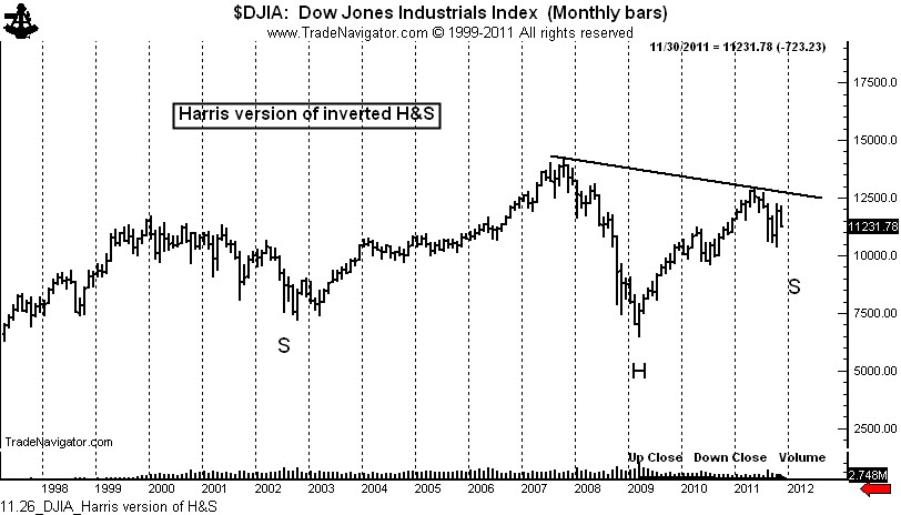
“I wonder why some analysts see a H&S formation but they do not see a potential inverse H&S formation when looking at the same chart above. The inverse formation has a left shoulder during the fourth quarter of 2002, a head formed during the first quarter of 2009 and a right shoulder under formation.”
If I am correct, the chart below is marked to exhibit Mr. Harris’ interpretation.
I would like to give Mr. Harris every benefit of the doubt on the interpretation he provides above, but the pattern he describes does not qualify as an inverted continuation H&S formation for several reasons, including the lack of an initial left shoulder high, a requirement for a continuation H&S pattern in a bull trend.
Point 6 – Log charts distort chart patterns. Harris states,
“Log charts are very useful in finance, especially in the longer-term analysis of returns and risks of financial assets but when it comes to chart patterns my opinion is that they are not appropriate because the compressions that takes place distort reality.”
Harris acknowledges that log charts are useful in finance, especially for longer-term analysis, and then dismisses stock charts from qualification.
The concept of the log scale is as follows:
- A stock bought at $50 needs to advance to $100 (or a distance of $50) for a 100% advance.
- A stock bought at $100 needs to advance to $200 (a distance of $100) for a 100% advance.
- A stock bought at $200 needs to advance to $400 (a distance of $200) for a 100% advance.
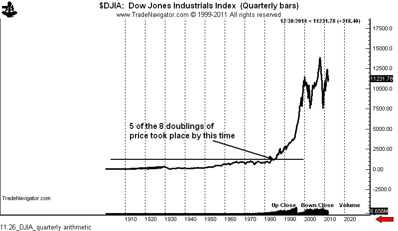
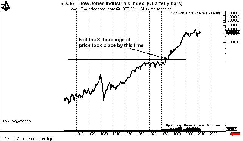
The scaling of log charts reflects these relative relationships. Economists studying long-term trends use log charts all of the time. In fact, it is arithmetic charts, not log charts, that distort reality in long timeframes.
By the way, the DJIA has performed a doubling act more than eight times since the 1932 low. A decline to the 2009 low removes just the last double, leaving seven in place.
I have stacked below the log and semi-log charts of the DJIA over the same time period. The first graph is arithmetic, as proposed by Mr. Harris. The second graph is semi-long, as I displayed in my post. You, as readers, need to decide which of the two charts provides better multi-decade perspective and bests displays the fact the Dow doubled in price five times from the 1932 low to 1984.
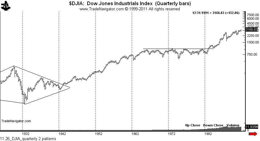
Point 7 – It makes no sense to look at long-term charts of the indexes due to the rebalancing of stocks within the indexes. OK, I understand your point, Mr. Harris, and it makes sense in a very elemental way. Yet, I disagree for two reasons. First, at least in the case of the broader indexes, a composite of free market enterprise is represented whether, for example, the transportation companies represented were manufacturers of buck wagons, steam-powered locomotive makers, container ship companies or modern trucking firms. The removal of U.S. Leather Company from and addition of Alcoa to the DJIA in the 1950s was just reflective of the changing nature of the economy. The same argument of rebalancing could extend to ignoring the long-term chart of an individual company simply because the management team has changed or its product lines changed. The Dow is a proxy of a certain slice of the economy, and as such, is subject to the types of mass human buying and selling decisions that can be reflected on a graph.
Second, long-term charts in the Dow have an established history of providing some outstanding trading signals. I will point to just two: the 30-year continuation diamond completed in the mid 1940s and the magnificent 17-year inverted continuation H&S formation completed in 1982.
I have no doubt but that Mr. Harris is a sound market analyst. Yet, on this current subject at hand we disagree. Who is right and who is wrong? I am not sure, because I do not believe technical analysis of stock trends can be adamantly reduced to “fact.”
$DIA, $DJ_F


Leave a Reply
Want to join the discussion?Feel free to contribute!