Analog indicates higher Nasdaq prices


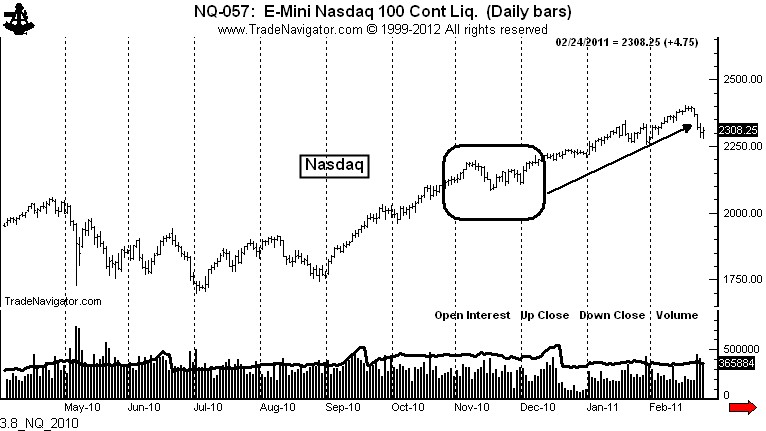
The 2010-2011 rally in the stock market is the analog for the current advance.

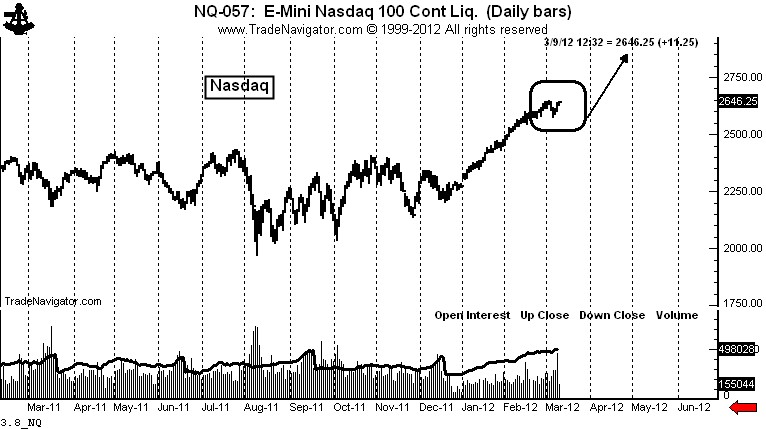
I have previously posted the reasons why I believe the current rally in the Nasdaq is an analog to the rally in late 2010 into 2011. If this analog continues to unfold, the present pause in the advance should be mild and brief, followed by another 10% advance in price.

The charts below compare the present rally in the Nasdaq to its analog in 2010-2011.

The type of sustained steady rally we have experienced from the December low seldom terminates with a top. This steady unrelenting rally is an indication of a dominant trend that will continue. Breaks are a buying opportunity.

Markets: $QQQ, $NQ_F


.

Shucks, it’s only Corn


The Corn market is not as glamorous as Gold or Silver or the stock market, but the Corn charts indicate that a sizable move is just around the corner


Note: Due to travel this is likely my last post until Sunday, March 5 or Monday, March 6

The Corn charts are extremely compelling. The market is setting up for a $1 per bushel or so move. The question is: “In which direction?” This market is a strong candidate for my 2012 Best Dressed List. But, trading this market will require some flexibility.

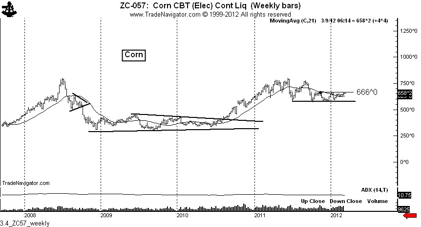
The weekly chart shows a line of very stout support at $5.75. This support line has been repeatedly tested since last July. A decisive close above $6.66 would complete a 5-month trading range. Also note that the trend-default moving average has turned up and the ADX indicator is below 11, a level at which a sustained trend could occur.

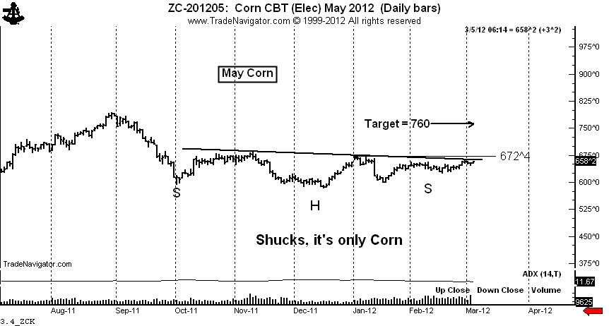
There are several features on the daily chart of May Corn worthy of note:

  1. If we include the June high the chart displays a possible 11-month H&S top with an extended right shoulder. I must point out that H&S top patterns are not bearish until they are completed — and even then they can fail.
  2. The right shoulder of the larger H&S top itself is a possible 5-month H&S bottom pattern. I define this phenomenon as an “interlocking H&S.”  The right shoulder of this pattern is extending.
  3. The ADX indicator has turned slightly higher after dipping below 10. ADX readings below 12 often precede sustained trends.

A decisive close above the Jan. high at $6.73 is required to complete this pattern. But, traders should also be alert for a H&S bottom failure. Cascading closes below the Feb. low, the Jan. low and then the Dec. low would all stack the deck for a bearish resolution in the Corn market.

Other markets:

There are only two other futures/forex markets I am concerned about during my current travels — Sugar ($SB_F) and $USDJPY.

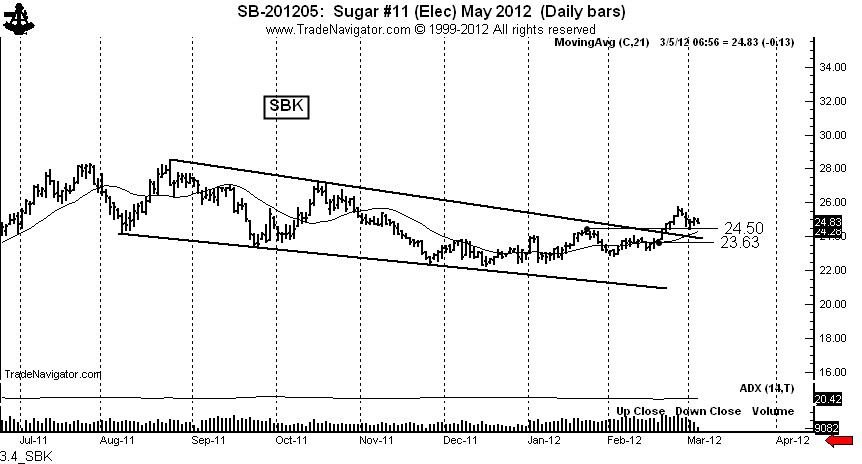
Sugar is NOT ready to accelerate at this time. The upside breakout on Feb. 21 has lacked the type of follow through indicative of a pending moon shot. Nevertheless, I remain long with stops below the market. I have a trigger finger with my long position. Open interest has increased by 255,000 contracts or 55% since early October. Prices are are at October’s level. This is not encouraging, even though the CFTC COT data are somewhat constructive.

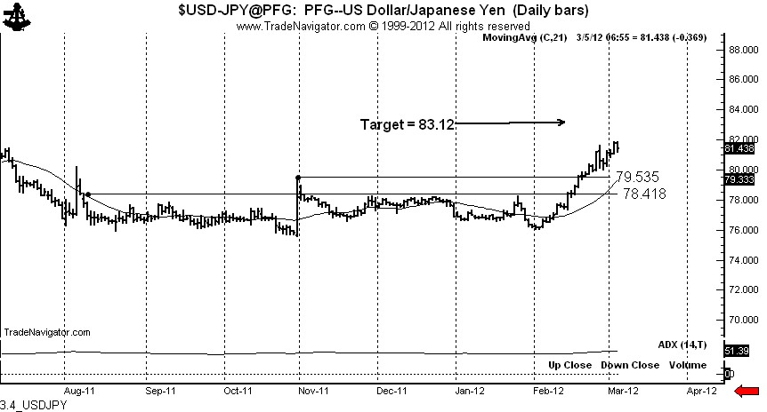
A bottom of some importance has been completed in $USDJPY. There are a cluster of targets from 83.50 to 85.20. A reaction to retest the late October high would represent an excellent buying opportunity.


Markets: $ZC_F, $SB_F, $USDJPY, $G6J_F


.

Silver: second highest weekly volume since the April top. What does it mean?


The volume in Silver this week will be the highest since the August top, second highest since the absolute top last April

An enormous slug of volume has entered the Silver market this week. In fact, by the end of trading on Friday the weekly volume will most likely be the highest tally since the August top. So, what does this mean?

Volume nearly always leads price in Silver. Silver trades must always be aware of the volume of trading at the Comex. Whenever the market gets hit with a slug of volume, traders need to ask themselves … “So what does this mean?” The record volume in late April allowed me to announce on this blog that Silver was a bubble and a top was being made. I announced the top on April 29. It was one of the easiest calls in commodities I have ever made. The tip off was volume. The volume and wrath of the hate mail I received after that call was tremendous.

The chart below shows that huge slugs of volume in the past year accompanied the April top, June bottom, August top, September bottom, and the sideways drift in November that resulted in a sharp but brief decline.

I have commented in recent days and weeks about the 10-month down channel in Silver. The market nicked the upper boundary of the channel on Tuesday and Wednesday, only to result in Wednesday’s sweeping key reversal.
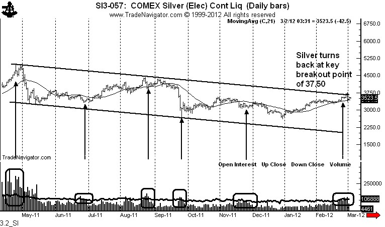
While I continue to see the upside resolution of this channel as a strong possibility, the sweeping reversal on Feb. 29 and this massive volume are issues the market must deal with in the short- to intermediate-term. Could the slug of volume this week be part of the buying pressure accompanying the breakout of the channel? This is a possibility. But my guess is that the volume indicates the upside breakout may not yet be ready to occur. In fact, this slug of volume and a sweeping reversal off a key chart point is giving me pause. I know how much you Silver bulls hate it when I switch course, but markets are living and breathing entities that, like ladies, tend to change their minds.

A blow up of the daily chart below shows off this volume more clearly.  The huge volume entered the market starting Feb. 21. The low of Feb. 21 was 3345. It would be any decline below this price that would give real signficance to the volume slug during the past nine days — a close below 3345 would mean that the volume was distribution by strong hands and that everyone who bought Silver since Feb. 21 would have a loss.
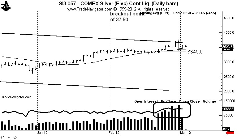
Big slugs of volume in Silver cannot be ignored. Subsequent price action will tell us much about the next $5 move in the market.

Markets: $SI_F, $SLV

.

Give me old time religion — the way we dinasours used to keep charts


You young kids have no idea how difficult it was to be a chartist in the “good-old days.”

We used to keep charts by hand — I know it is hard to believe, but computers and charting programs have not always been around. In the 1970s when I started trading the only printed charts available were from Commodity Reserach Bureau. I would receive them once each month and update the markets I was watching by hand.

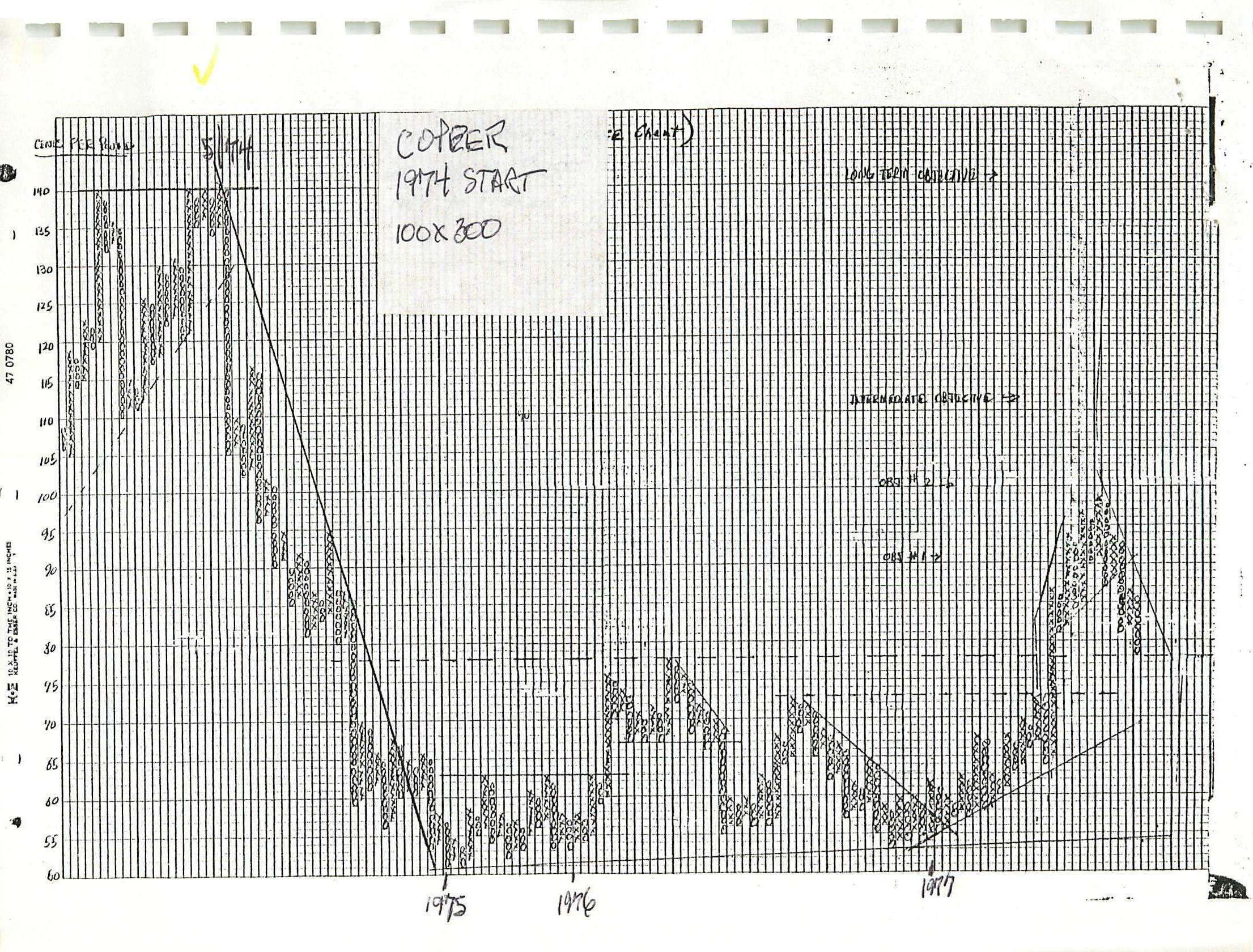
I also maintained a number of “by-hand” charts. I discovered the charts below over the weekend cleaning out some old files.

Copper

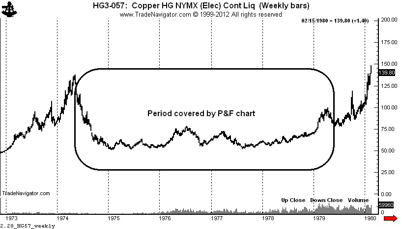
I was keeping a point and figure chart of Copper in the late 1970s. The market formed a P&F compound fulcrum. Below is my P&F chart followed by a “modern” candle chart of the same period. My target of $1.40 was met. I cannot recall hour many hours went into the P&F chart. I created the bottom chart in 25 seconds.


Stock market

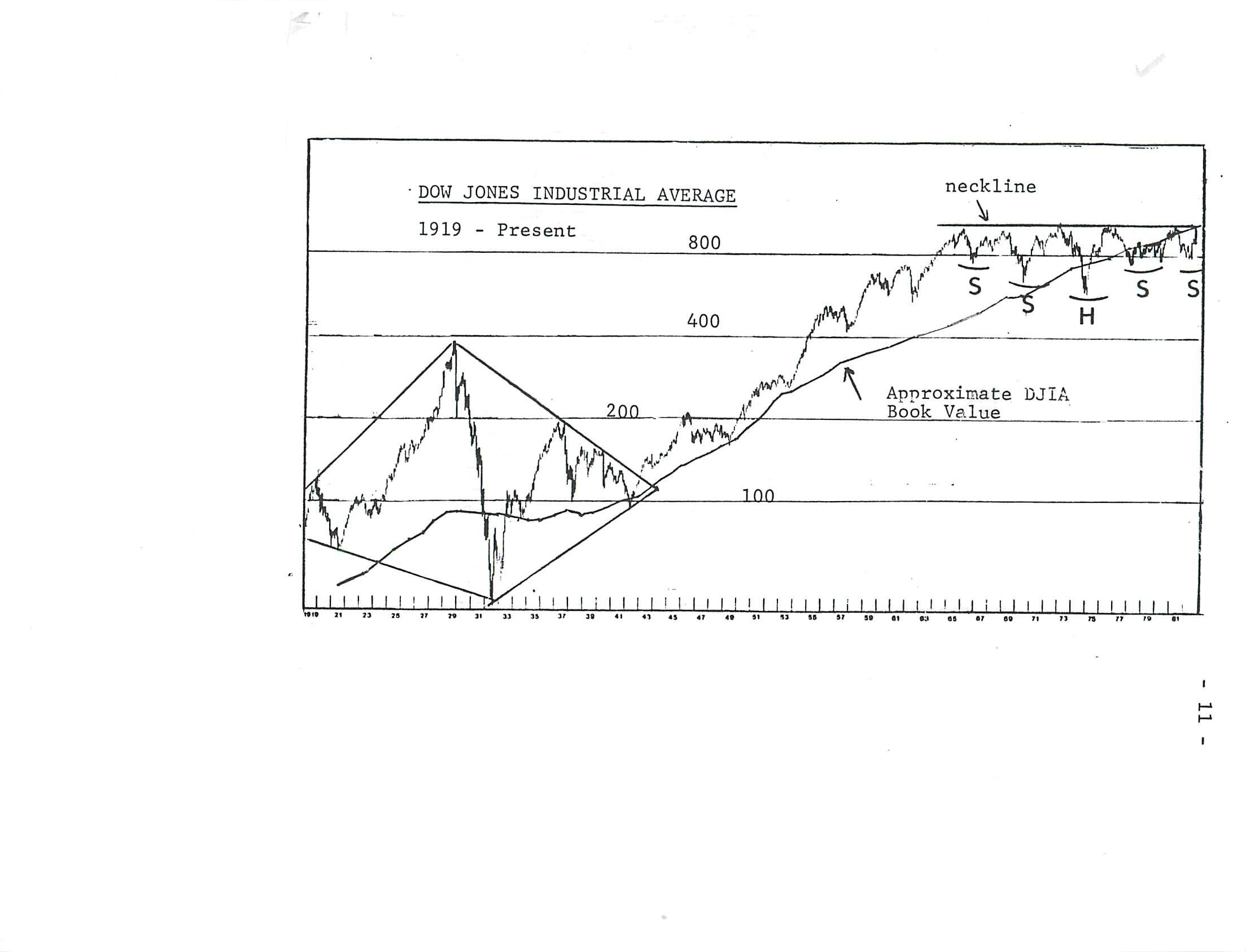
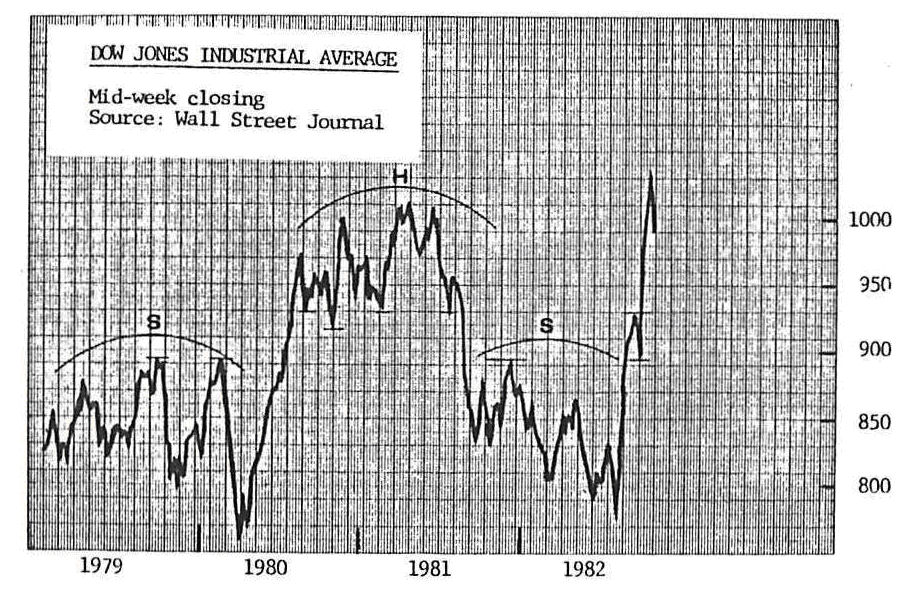
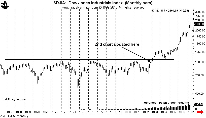
The next two charts represent the U.S. stock market as of mid 1982, represented by the DJIA. At the time I interpreted the chart as a complex continuation inverted H&S pattern. I was watching the area of 1,060 for a breakout. My objective at the time was 2,200. A “modern” chart of the time follows the two charts I was updating by hand.


Call me old fashioned — it fits, but while charting was more difficult I think trading was much more exciting and challenging (in a good way) back in the days when kids walked four miles to school.


###