Must read for commodity and commodity ETF traders — U.N. paper on the structural changes of markets from HFT


The embedded PDF below is a MUST read for traders of commodities and commodity-related ETFs.

This academic paper attempts to analyze the structural and permanent changes to commodity markets from high frequency trading. If you do not see the pdf, click here.

[scribd id=87355838 key=key-2m4o79upd3jre1gpyzm3 mode=list]


###

Corn flashes major sell signal


Decline on Mar. 28 makes Corn a candidate for 2012 Best Dressed List

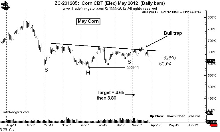
I have commented for many weeks that the 6-month congestion in Corn was due for a decisive resolution. The ADX index reached a level of 10 in late February, a level that normally precedes a major trend. Often the first thrust after a low ADX reading is the false move, followed by the real trend in the opposite direction. This is exactly what happened with the upward bull trap breakout in mid March.

The decline below the Feb. 16 low at 626 was the official sell signal in Corn. The target is now 4.65, and then 3.80. There may be rallies along the way — and the first rally could occur after the grain stocks report on Friday. A rally back into the 626 area would be a shorting opportunity.

Confirmations for this bear trend will occur by closes below 6.00 and then 5.84. May Corn should not close back above 6.34 or this analysis is placed into question.

Markets: $ZC_F

Disclaimers:

  • I currently have a short position in Corn.
  • My trading approach generates approximately 30 to 40 signals per year as candidates for the Best Dressed List. Half of these signals fail to materialize in a sustained trend.

Note to readers: On April 10 I will be hosting a special webinar to discuss the last two Boot Camps scheduled for the U.S. I will announce the details of this webinar next week.

U.S. health care: Highest in the world in cost, 37th in performance. This system has already been declared guilty.


The health care system in the U.S. is 40% more expensive per capita than the next most expensive OECD developed countries

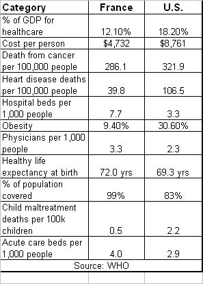
As a country, approximately 18.2% of our GDP is devoted to healthcare spending. Switzerland and France (#2 and #3) spend respectively 12.3% of 12.0% of their GDP for health care. The U.S. spends the second greatest amount of GDP for health care among all members of the United Nations, topped only by East Timor.

For its money, the U.S. obtains health outcomes that are near the bottom of the OECD rankings, and, in fact, rival some of the outcomes of Third World countries.

From extensive experience with the U.S. health care system as a medical patient, and in-depth research of the counterpart systems in other developed countries, I can confidentially say that by nearly every measure the U.S. is a failure.

Unfortunately, Obama Care from its very inception addresses few of the flaws within the U.S. health care system. In fact, if anything, the mandates of Obama Care worsen our nation’s health.

As the U.S. Supreme Court begins its hearings today on the constitutional challenge against Obama Care, I would like to share with you what I have experienced and learned during my 28 years of reliance on this nation’s health care system.

I find it beyond belief that the U.S. Supreme Court will pass final judgment using legal arguments on a health care system that has already been declared a failure on its own merit.

The remainder of this post summarizes my personal experience with the U.S. health care system and some vital statistics on its world class expensiveness and failed health outcomes.

My anecdotal experiences

On August 26, 1984, while sleepwalking at 2 AM, I took a “Peter Pan” onto a concrete slab 18 feet below the railing of the deck out our bedroom sliding door. That it was a rude awakening is an understatement. That I did serious damage to my spine is more of an understatement. I ended up in the hospital for 42 days and spent 6 months in a full hard body cast. In the process I needed to relearn the skills of walking and conducting many other routine aspects of living.

At the time of my accident I lacked health insurance. I paid every last cent of my medical bills during the ensuing two years.

During the past 28 years I have: (A.) navigated a burdensome and overly complex and health care delivery system; (B.) endured four major spine surgeries and countless radiological tests and other medical procedures; (C.) relied repeatedly on the false promises of big pharma; and, (D.) pursued numerous experimental and trial treatment protocols. In the process I have learned first-hand how difficult, complicated and expensive  U.S. health care system is to navigate. Anyone reading this post whom has experienced an undiagnosed or complicated chronic medical condition knows exactly what I am talking about.

Of course, we hear everyday how the U.S.health care system is the best in the world. Nonsense! Our health care system is a patchwork created by special interest groups (especially “big pharma”) and political ideology, not by the medical needs of a nation. For relatively healthy U.S.residents, the American health care system is superb. But, get really chronically ill and you will find out what the octopus is really like.

Let the data tell the story

I was raised to believe that trees and plants can be judged by the fruit they produce. Good trees produce good fruit, bad trees produce bad fruit. I was raised to believe that facts speak louder than words. So, what are the facts related to the U.S. health care system

Costs

  • The cost of the U.S. health care system is approximately $1.7 to $1.8 trillion per year, inclusive of all related costs, including litigation
  • The U.S.spends approximately 18.2% of its GDP on health care related expenses
  • The cost per capital in the U.S. for health care is approximately 40% to 50% higher than the next most expensive countries (Switzerland, France and Germany) and nearly double the average cost of 30 OECD health care systems
  • Despite the present expensiveness of the U.S.system, nearly 50.7 million residents, or 16.7% of the population, are either uninsured or grossly under insured. By contrast, all residents of most other OECD countries are covered by health care insurance
  • Medical debt contributed to 46.2% of all personal bankruptcies in the U.S.

Outcomes

  • Despite being the most tested, most hospitalized and most over-pharmaceuticalized citizens in the world, the U.S. health care system produces nearly Third World outcomes by nearly every measure
  • The comparisons below rank the U.S.to all other countries that maintain apples-to-apples statistical data sets
  • The World Health Organization ranks the U.S. system as the highest in cost, 37th in overall performance, and 72nd by overall level of health among 191 member nations included in a study
  • The Commonwealth Fund ranked the U.S. last in the quality of health care among similar developed countries

There is nothing in the Obama Care model that will improve the cost/outcome performance of the U.S. health care system. NOTHING!
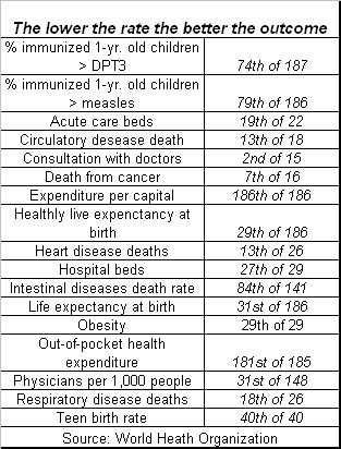
So, what works?

There are health care models that provide superior outcomes for far less expense (as measured on a percent of GDP basis or cost per person).

The consensus in the U.S. (especially among political conservatives) is that the Canadian and the U.K. health care systems are not the direction the U.S. should go. From my research, I agree entirely. But I disagree completely with my conservative brethren that the government should not play a major role in the health care system. In fact, I believe the U.S. government has a major role to “serve,” just not the role it is presently “playing.”

The countries with the most promising health care systems include Japan, Taiwan, Singapore, Germany, Switzerland, France, the Netherlands, and the Scandinavian countries. By all measures (cost and health outcomes) these countries smoke the U.S. And, contrary to what political conservatives say, the doctors in these other countries are not all trained at U.S.medical schools.

Yet, the majority of the countries cited above tend to be more racially, educationally, socially and economically homogeneous than the U.S. population. Except France! France has more diversity in these measures than the other comparative countries. While wide social, economic and racial diversity does complicate health care delivery to some degree, the problems with the U.S. model are systemic, foundational and political.

The French health care system, while far from perfect, is greatly superior to the U.S. health care system by most measures. It is unacceptable in politically conservative circles to compliment France for anything. Yet, data on the following table speak for themselves.
 

This harsh critique of the U.S. heath care system is by no means an indictment againts all health care services in this country. My personal search for sane, cost efficient and quality health care services was finally fulfilled when I first visited the Mayo Clinic in Rochester, MN. The Mayo and a few clinics like it, such as the Cleveland Clinic in Ohio, understand how to conduct cost-effective medicine and care for its patients. I applaud the Mayo. I owe whatever qualify of life I now have to the Mayo. I only wish I lived in southern Minnesota.

What few people know is that the Mayo and Cleveland Clinics, along with a few other providers who “get it” provided members of Congress with their own version of health care reform during the original debates. Their proposals and the cost savings they would have brought to this country were research based and verified by the Wharton School of Management.

Unfortunately, it was politics as usual and the Mayo model did not see the light of day in Washington.

Summary

It really does not matter how the U.S. Supreme Court decides on the issue of mandated health insurance. This component of health care is like a fly feeding on the carcass of a dead elephant.

The health care system in the U.S.has already been tried in the courts of “cost” and “outcome” and been found guilty on all counts.

Additional tables that tell the tape

These tables are based on slightly old data, but they still demonstrate the point.

[scribd id=86793940 key=key-24twhk1tjv9uw33hojyk mode=list]


#SCOTUS


###


.

Sound bites from Uncle Benny the Bozo


This collection of sound bite clips from Uncle Benny leading up to the financial melt down of 2008 shows just what a bozo he really is

It is freighting to think that Benny B. and Cousin Timmy G. have such  broad and unaccountable control of our economic future.

Click here to play.


Scary!


###

Copper, stopper, build a topper?


Some charting evidence of a pending top exists in Copper.

This evidence includes the likely build up of a large volume of sell stops just below the market. The weekly chart shows that the rally from the October 2011 low has simply retested the double top completed last September. My macro friends tell me that demand for Copper in China is on the wane — and China has been the world’s biggest driver of Copper prices in recent years.

Also note on the weekly chart the possibility of a 29-month H&S top pattern. We are a long way from having this pattern come into play, but if prices start down keep it in the back of your mind. But, remember, I am NOT a big fan of up-slanted necklines on H&S tops.

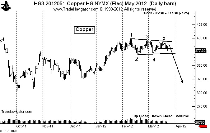
The daily chart displays a clearly defined 2-month symmetrical triangle. Because this triangle has five contact points it can serve as a top pattern — pending a close below the existing March low. There are no doubt stops gallore below the February and March lows. Markets — almost magically — are drawn to important chart points. These stops could result in follow through, which could possibly put a top in the market for 2012. Thus…Copper, stopper, build a topper.

Even if a downside penetration is not made, this pattern could still prove to be bearish. Over the years I have noticed that the upside completion of a 6-point triangle with three distinct highs and three distinct lows is the last gasp of a bull trend.  This is NOT true for four-point triangles, which tend to thrust prices considerably higher.

Thus, should prices move out of the top of this pattern and suddenly reverse back into the pattern it would be a significant sell signal. The failure of patterns to result in an expected move often times has great technical significance. The critics of classical charting principles fail to grasp this nuanced concept.

Markets: $HG_F, $JJC


###

My dilemma over the prices of corn & soybean meal


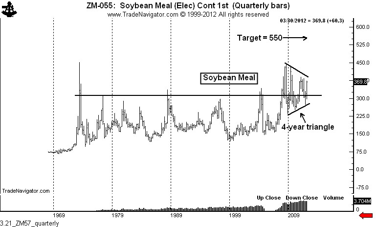
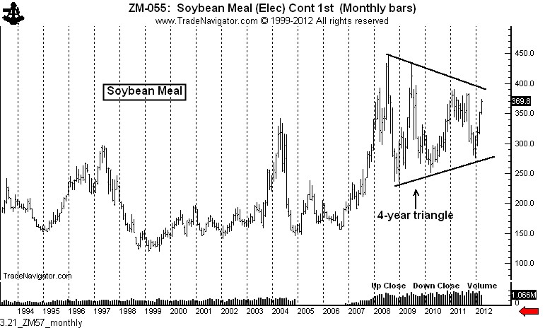
The long-term chart of Soybean Meal is outstandingly bullish. Yet, the chart of Corn is potentially quite bearish. Which one is lying? What does a trader do?

Being double minded is a dilemma every discretionary trader faces from time to time. It is not a fun place to be. It is where I am presently on grain prices.

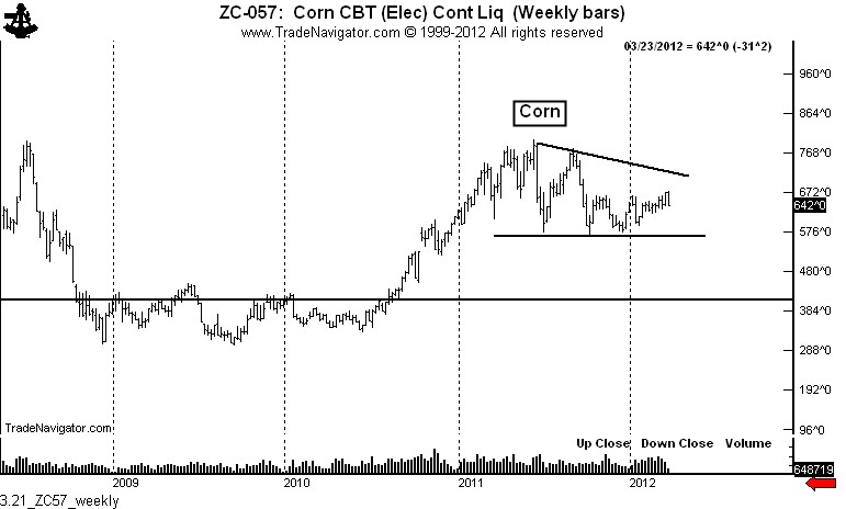
The daily and weekly charts of Corn are quite negative (at least potentially). The daily chart (not shown) displays a possible H&S top. The weekly graph shows a descending triangle. In fact, the Corn charts point to a price target of $4.00 +/- $.25, pending the completion of the large top. I am short Corn. I have a strategy to add to this short position as my current holding becomes profitable.

Yet, the long-term charts in Soybean Meal are potentially explosive. The quarterly and monthly graphs display a potential 4-year continuation triangle that portends a price of $550 per ton.


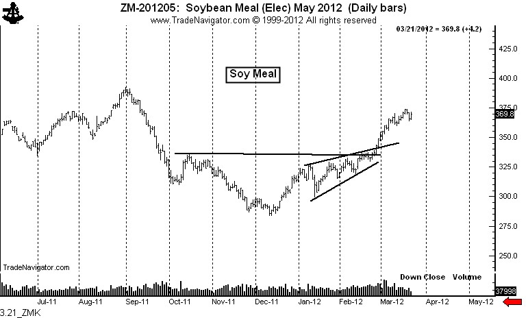
The daily Soybean Meal chart is in a strong advancing trend — but is, in fact, quite overbought by just about every measure.

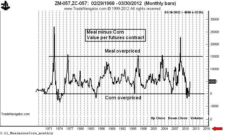
So, I have reason to be constructive about Meal and negative about Corn. There is reason to believe Corn can lose to Meal. The chart below displays the relationship of Meal to Corn prices (expressed in terms of the dollar value of the nearby contracts). Historically Meal remains cheap compared to the price of Corn. But there is no way Meal can go to $550 while Corn goes to $4.00. Such a relationship would become a new all-time high in the relationship by a country mile. And this is not going to happen.

Here is where I come out on this dilemma.

  1. Meal has met its upside target on the daily graph, so I will not chase the rally. It would take at least an 8-week consolidation period to interest me in the long side.
  2. The spread (one contract of each) has moved about $6,000 in favor of Meal in the past three months, so I am late to this party.
  3. The Corn market has given some early warning signs of a top, although a top is far from complete.

So, I will remain a light short in Corn, protected by stops. In the final analysis, my opinion is that each chart needs to be traded on its own merit. One of these markets is lying. But I can only trade what the market shows me at the moment.

Markets: $ZC_F, $ZM_F


###

GAZ — an ETF that is full of hot air


Playing the Natural Gas market via ETFs is a fools game — the ETF prices have nothing to do with reality

This past week I got into an intersting email discussion with Kid Dynamite, a fellow blogger. KD publishes Kid Dynamite’s World and his insightful Tweets can be followed at @KidDynamiteBlog

Our discussion centered on his keen observation that the price of some ETFs have everything to do with pure speculation, technical trading and the complicated structures and mechanisms of the ETFs and nothing to do with the price of the underlying assets.

The ETF in question was GAZ — an ETN that is hypothetically designed to track the price of Natural Gas via the Dow Jones UBS Natural Gas Sub Index. The reality is that the price of $GAZ in recent weeks has had nothing to do with the price of Natural Gas. This divergence has to do with the way these ETFs are created. KidDynamite posted an excellent article on this over the weekend — check here for the post titled “GAZ – the ultimate greater fool trade.”.

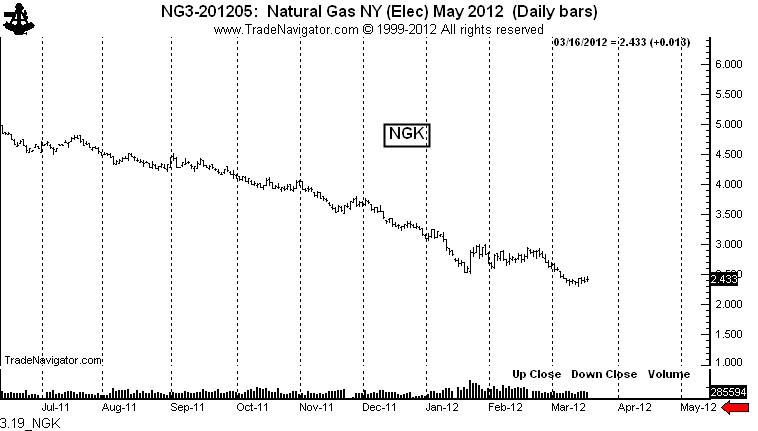
The daily charts below show the prices of the May Natural Gas futures ($NG_F) and our current villain, GAZ. As you can see, prices of the ETF and the underlying commodity have diverged since the January low with Natural Gas drifting into a new low while GAZ is undergoing a bull thrust.

This divergence between $GAZ and $NG_F tickled my interest, so I examined the relationship over the past five years between the following:

  • Natural Gas futures — the nearby futures contract
  • Natural Gas futures — Dec. 2012 delivery contract
  • $UNG – ETF
  • $GAZ – ETN
  • $FCG – an ETF representing companies with significant stakes in the Natural Gas market

All of these markets have experienced significant declines from the 2008 high in energy prices. But, the declines have varied widely — to the point one must question the correlation between the underlying commodity and the ETFs supposedly tied to the underlying commodity.

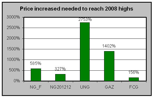
The table below shows the price increase needed by the different markets to recover the ground lost since the 2008 highs.

Investors who bought FCG at the 2008 high need only a 156% increase to break even (dividends excluded). Traders who have been long the nearby futures contracts (rolling it forward each month) need a 585% increase in the cost of Natural Gas to break even, athlough this is understated because speculators would have lost additional money on each roll.

But, buyers of UNG and GAZ need a 2,753% and 1,402% respective rally to get back to the 2008 highs. This is not exactly what I would call a good correlation with the underlying asset. Keep in mind, GAZ and UNG are NOT ultra ETFs which one would expect to experience a much greater decline than their underlying assets.

These shocking statistics should alarm traders who think that commodity-specifc ETFs are anything more than vehicles for speculation — and a path for huge profits for their creators.

GAZ has the ability to divert from the underlying because the price of GAZ really has no connection with reality. This highlights a real dilemma with commodity-based ETFs compared to the futures market. Futures market contracts are subject to delivery and expiration, forcing prices between futures contracts and the underlying commodity to converge.

By contrast, there is no exacting mechnism to keep honest the ETFs and ETNs hypothetically linked to commodities or commodity indexes. The price of ETFs such as GAZ ultimately could go wherever the force of speculative fever wants to take them. Whereas I trust KidDynamite to explain the technical reasons for the GAZ, I am much more concerned with the trading implications for all commodit-specific ETFs.

I believe that this disconnection with any reality other than the actions of speculators and manipulation by orignators will be the ultimate downfall of commodity-specific ETFs. At some future time the creator of these derivatives will need to find a way to actually have the derivatives live in the same world occupied by the underlying assets. Until this happens, traders engaging with commodity-specific ETFs need to know they are just playing craps.

GAZ and similar ETFs are full of hot air. If you have contrary thinking (reasons why these ETFs have some economic connection with reality) please reply on this post.

Markets: $NG_F, $GAZ, $UNG, $FCG


.

###

Using volume as a leader indicator for silver prices


Big slugs of volume after an advance are nearly always a sign of a top

Big volume that comes into a market after a run up in price means who things:

  1. Speculators who were on the sidelines for most of the advance finally threw in the towel and chased the market — beliving the advance would be infinite.
  2. Speculators who actually had positions during the run up as well as commercials wishing to hedge production or inventory obliged the late buyers

Thus, a big expansion of volume is a good indication that a top of some duration may be in the making.

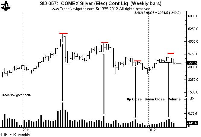
The weekly chart of Silver futures below shows that big volume spikes put the top in the market in late April, late August and again in early March.

Huge volume during the breakout of a congestion area also can indicate the validity of the breakout. In other words, big volume spikes usually represent starting volume or stopping volume.

Just a word on Silver — the volume that accompanied the April high was historic. As my blog post in early May pointed out (see here), eight years of Silver supply was traded in one week. V0lume spikes such as we had in late April can cap a market for a very long time. To overcome this volume top, Silver must form an extensive bottoming pattern and breakout to the upside with greatly expanded volume. Until this happens, all rallies followed by volume spikes will represent a selling opportunity.

$SLV, $SI_F


.

A study in frustration: What do you do when you become a sold out bull?


It never fails. At least once each year I will be dead right on a market, but price action will frustrate my trading actions.

In 2012, the Sugar market is a leading candidate to meet the above definition. If you follow this blog you know that I have considered the charts in Sugar to indicate a massive advance — perhaps all the way to 65 cents. This judgement is based on the quarterly and monthly graphs.

Yet, an opinion is not a position. My trading plan dictates that I enter trade based on recognizable chart construction and that I use money management protocol to limit my loss to no more than 1% of capital (2% if all the stars are aligned in a market, which was not the case in Sugar).

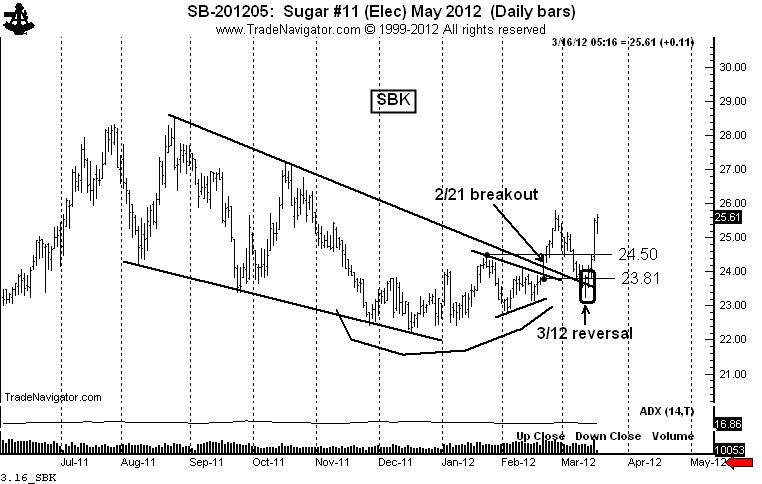
On Feb. 21, May Sugar completed a 4-week symmetrical triangle (small patterns often complete larger chart construction) and penetrated the upper boundary of a 6-month falling wedge. Accordingly, I went long at an average price of around 24.22.

I fully expected that the market would do a moon shot. Yet, on Feb. 29 the market closed below the low of the high day of the move, which was Feb. 27. If you read my book, you might remember how this is a warning in what I call the “3-day trailing stop rule.”

I exited half of my position at 24.34 on Mar. 6 and the remainder of my position when the Last Day Rule of 23.81 (see book) was violated on Mar. 9. I had a sizable position in Sugar, and all of a sudden I was on the sidelines.

On Mar. 12 the market completed a one-day upward reversal. Normally a single day’s price action means nothing to me. However, when I think a market is poised for a big move a one-day reversal takes on significance. So, I reentered only half of my original position on the Mar. 13 open at 23.86.

Bottom line: The market is proving me to be correct and I have only half of the position I wanted to have.

So, what should be my response? Should I chase the market? Should I sulk and moan that the boat has left the harbor and I am still standing on the pier? Absolutely not. I will tell you what my opinion is of market situations such as this:

  • A good trade must be right on both direction and timing. If one of these factors is wrong, the trade is wrong.
  • I have trading rules and I must follow them. If my rules prevent me from participating in a market I correctly called, so be it.
  • Traders MUST force discipline upon themselves, even if it means a move will be missed.
  • There will always be another market. It is a sign of trouble when a trader feels he or she must be in a given market even if the set up was not right.

So I am long half of a position. I need to be happy about this. It is important for a technical trader to be driven by precise signal set ups, not by market opinions or emotions. Emotionally it is tough for me to watch Sugar rally. So what? Emotions are never a reason to be in a trade.

If the Sugar charts do not give me what I need to become fully positioned, well so be it, it will not be the first time nor will it be the last.

I have a stop at break-even. My guess is that somewhere along the way the Sugar charts will give me another chance to extend my position — and do so according to my terms. I never like trading a market according to its terms.

Markets: $SGG, $SB_F


.

Japanese Yen reaches initial target .. is the 2010 high the next target?


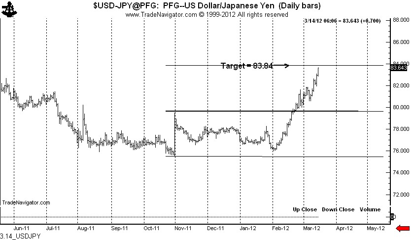
The price objective of 83.80s from the 6-month double bottom in the $USDJPY has basically been reached with today’s advance.


There are no promises beyond 83.80 based on the daily chart, although point and figure charts do yield a target of 85.40.

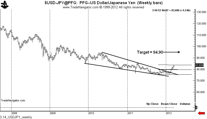
There is a possibility that the mid-February advance completed 26+ month falling wedge on the weekly graph. This pattern, if correct, provides a price goal of 94.90. The daily and weekly charts follow.


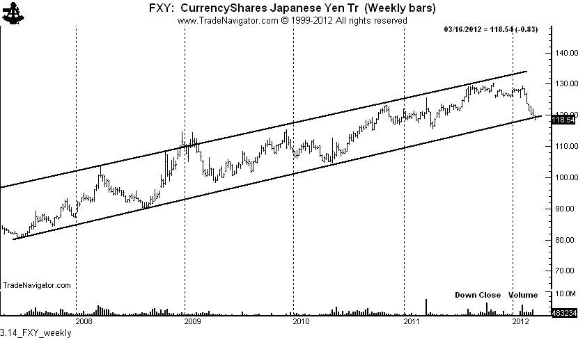
The weekly chart of $FXY, the Yen ETF (traded as a reciprocal to $USDJPY), shows that prices are challenging the multi-year trend. This this trend channel is decisively penetrated the objective would become a retest of the 2010 low at 104.48.

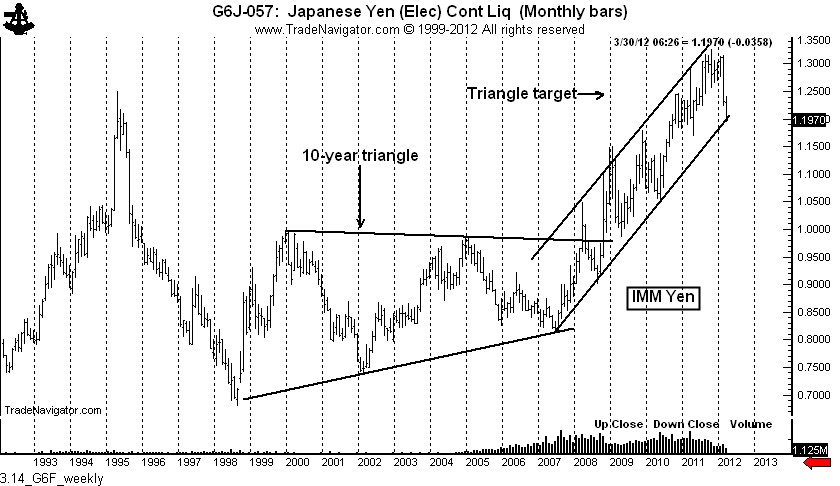
A chart of the IMM Yen futures is also shown. Yen futures ($G6J_F) also trade at a reciprocal to $USDJPY. Note that the 10-year triangle, completed in Oct. 2008, met its target.


Markets: $FXY, $USDJPY, $G6J_F


.